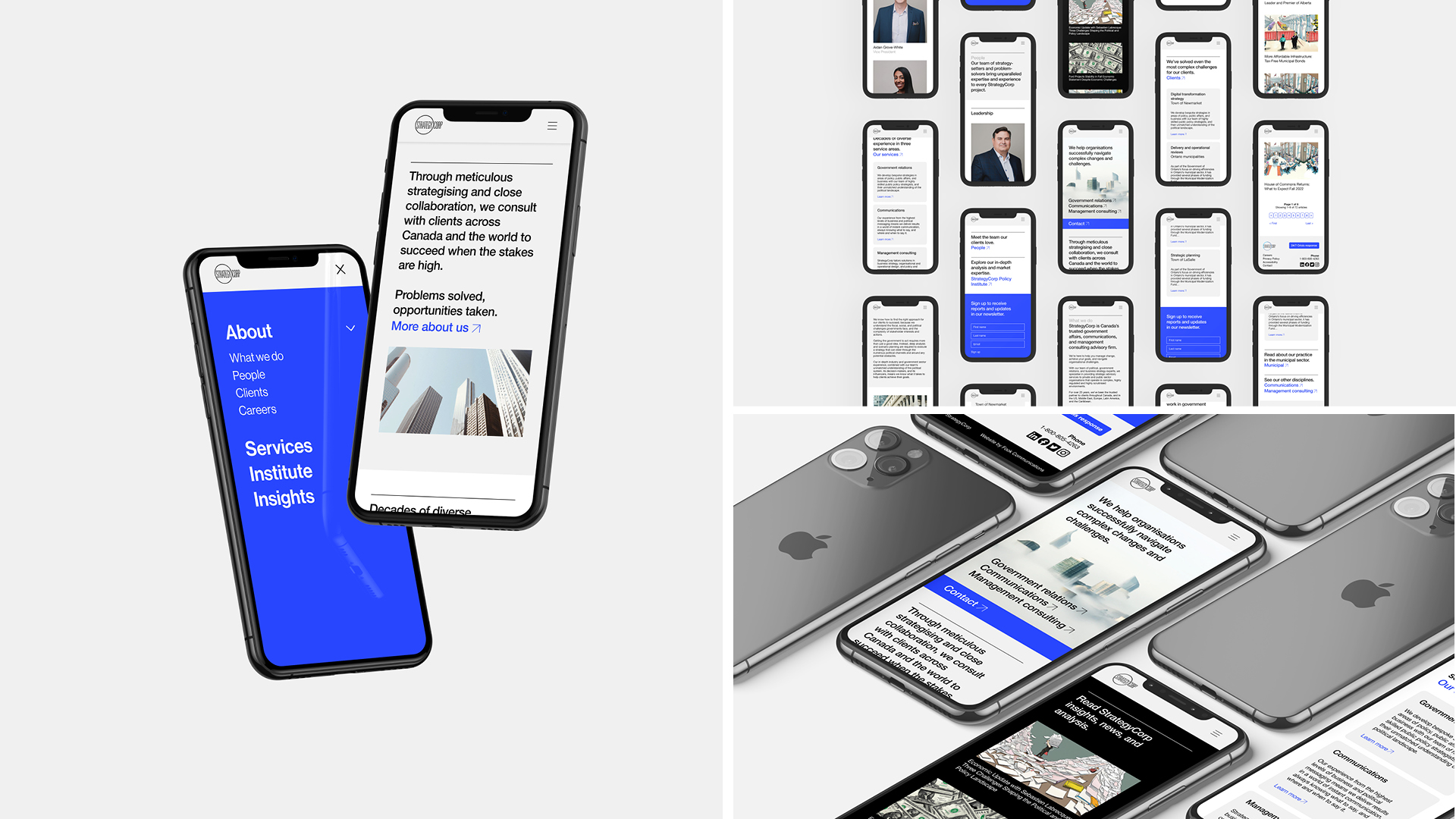
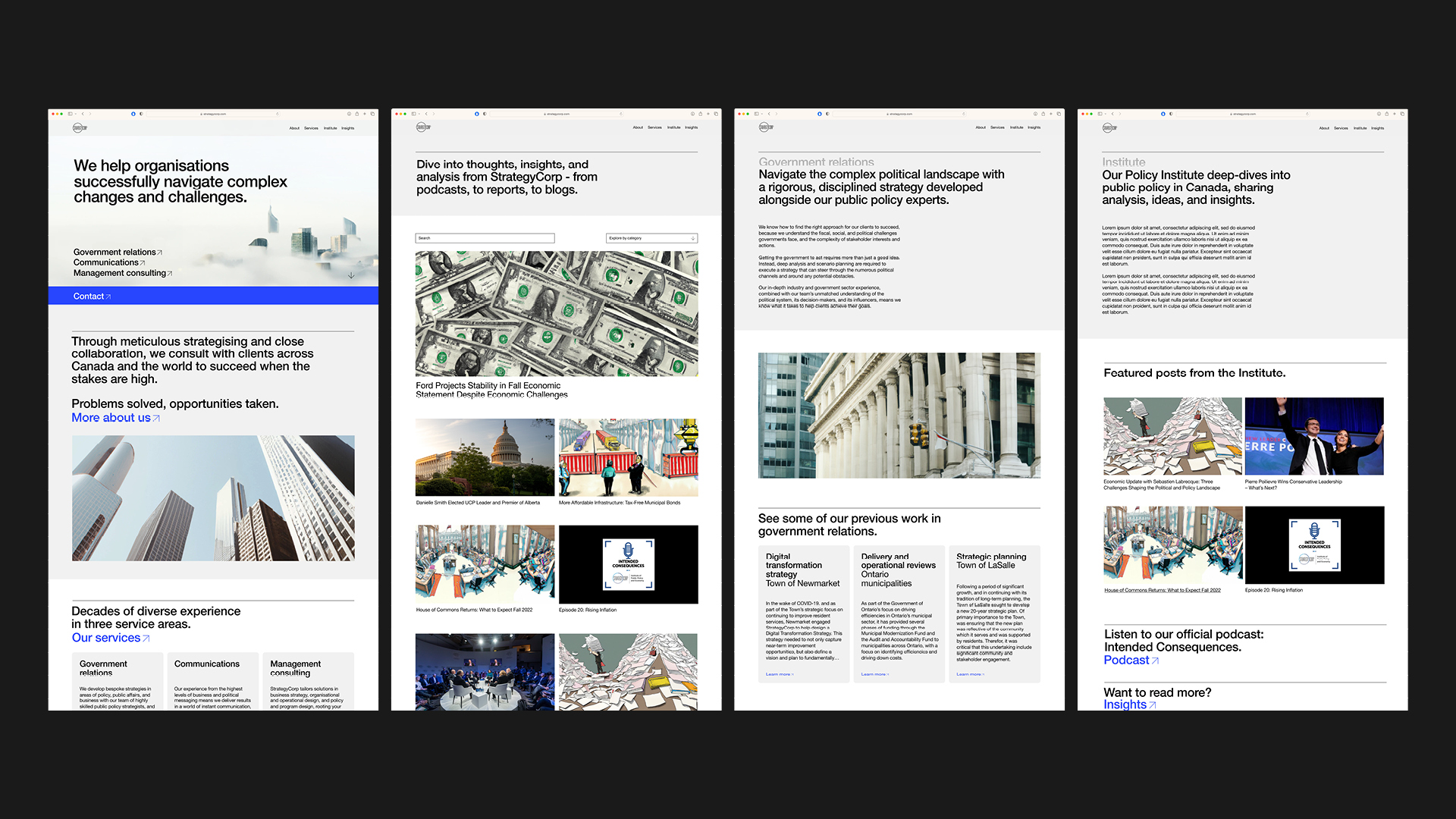
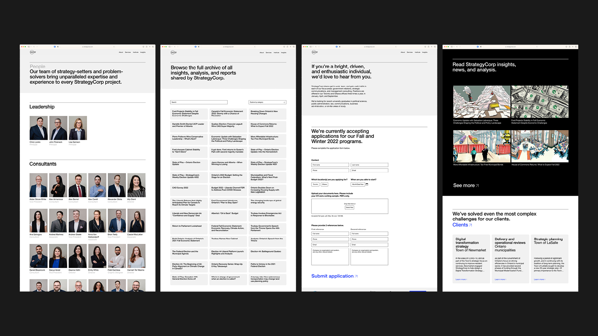
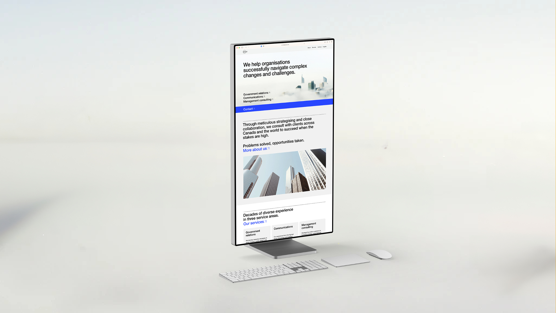
Through our meticulous design process, StrategyCorp’s new website is clear and intuitive, and boosts brand perception.
Copywriting, Graphic design, Web development
Background and challenge
A strategic advisory and management consulting firm with clients around the world, from government bodies to 7-Eleven, StrategyCorp came to us to improve their online presence.
With an existing website that was dated, difficult to use, and didn’t accurately convey who they were or the quality of their service, our job was to develop a site that properly represented them and their reputation.
So, we set about creating an intuitive website that elevated them above their competition, and presented information with clarity and purpose.
And beyond the typical creative challenges in a project like this, another key challenge here would be navigating a corporate environment with many senior leaders and multiple opinions, to deliver a website that everyone would buy in to.
"Fook brought our super dated website into 2023. They were really attentive and patient with us, especially given our internal conflicts re: how we present ourselves, etc. They were great to work with, and we'd definitely recommend them."
Rosa K – Marketing Specialist
Process and solution
Before beginning any design work, we first ran workshops with StrategyCorp to gain an in-depth understanding of what they do and the goals they were trying to achieve. In order for us to authentically communicate on their behalf and build a website that truly contributes to their objectives as a company, these initial explorations were vital.
With many stakeholders having skin in the game, this background was also necessary to ensure buy-in across the board by grounding every decision we took in strategy. Getting an entire corporate team behind our work meant having clear justifications behind our decisions that were anchored in a total understanding of what they were trying to achieve.
So, having worked with them to shape a clear picture of who they are, it was then onto the more creative side of things. The next step was to audit and update their existing visual identity. With all of the insights we’d gained around their brand and their vision, we had to make sure we had the right foundational tools to build a website that properly reflected all of this.
To make their brand feel more contemporary, we explored secondary typefaces and additional colours, and added a couple of options that stayed true to their existing brand while giving us the flexibility to modernise it.
We also wanted to develop a high-quality and unique approach to imagery, but we knew that budgets were limited. Good visual content is a huge part of any website, so we wanted to avoid using generic stock images and instead find a way to generate a unique style that really added to the website experience, without breaking the bank.
So, we used Dalle 2 to generate a series of AI illustrations, thoughtfully using the tool to create a consistent art style that could be an ownable aesthetic for StrategyCorp.
Then began the website work itself. We first created a design concept just for the homepage, and moved through multiple stages of delivery and approval to hone in on a full website design we all loved. With final design approval, we sent the work to the development team who perfectly translated the design into the live website.
Result
From every angle – design, messaging, positioning, and technical quality – this new website has hugely improved StrategyCorp’s digital presence.
Our design and writing process was precise and measured, refining towards an approach that balanced feeling fresh and modern with seriousness and professionalism. Backed up with thorough background work, we ensured the final website delivered on exactly what StrategyCorp needed.
By investing this time in understanding them, and walking their team through our process clearly and thoroughly, not only did we create a website that nailed our brief, but we did it with total buy-in from their team.
The outcome is a website that elevates the perception of their brand and truly reflects their organisation. They now have a site that makes it simple to explore and understand the company, and succinctly articulates who they are. And the cherry on top, it’s fast, responsive, and secure.


