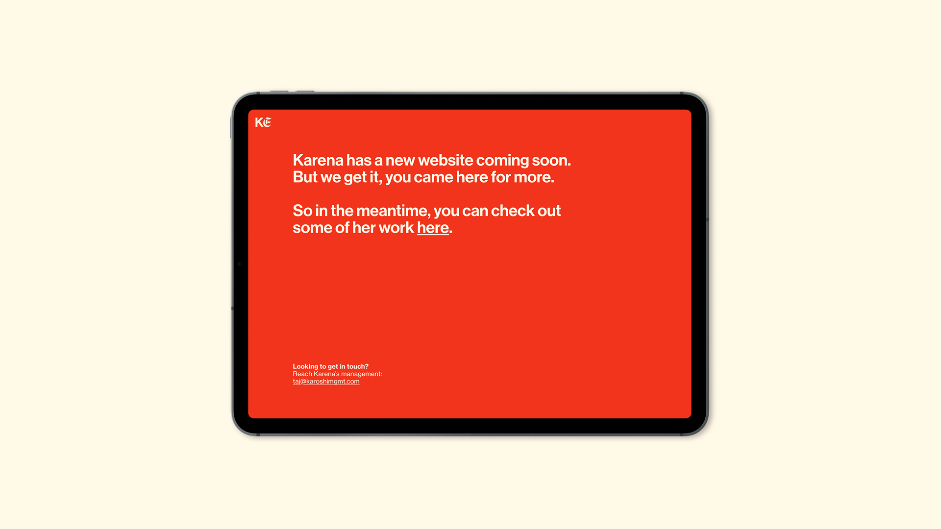
Crafting a visual identity for one of the most sought-after talents in entertainment.
Branding, Copywriting, Graphic design, Web development
Background and challenge
Karena Evans is one of the most exciting directing and acting talents in entertainment. Having directed for the likes of HBO, Fox, Drake, Coldplay, and Adidas, and now working in film, TV, and fashion, Karena needed a brand identity that could grow with her ever-expanding influence and reputation.
And from the outset, she emphasised the importance of her new branding reflecting her humble character, but also her artistic vision. It needed to be an authentic portrayal of who she is, and the stories she tells.
Through her work, she subverts narratives, and challenges the ethical issues of our time, doing so with trademark emotion, and energy. With empowerment and representation being consistent themes in her creations, she truly wants her work to take centre stage, and so her visual identity had to reflect all of these characteristics.
"The Fook standard is exceeding expectations."
Karena E – Director
Process and solution
Creating a brand identity that matched Karena’s global reputation, that was capable of matching an even bigger reputation years down the line, and that authentically captured Karena the artist and person was the type of challenge we love to take on.
With so many big boxes to tick, it was important to deeply understand her in order to create an identity that felt true to her. We meticulously studied Karena’s work, noting the consistent moods, tones, and colours she uses. We learned about her story, her motivations, and the artistic thread that ties together everything she does.
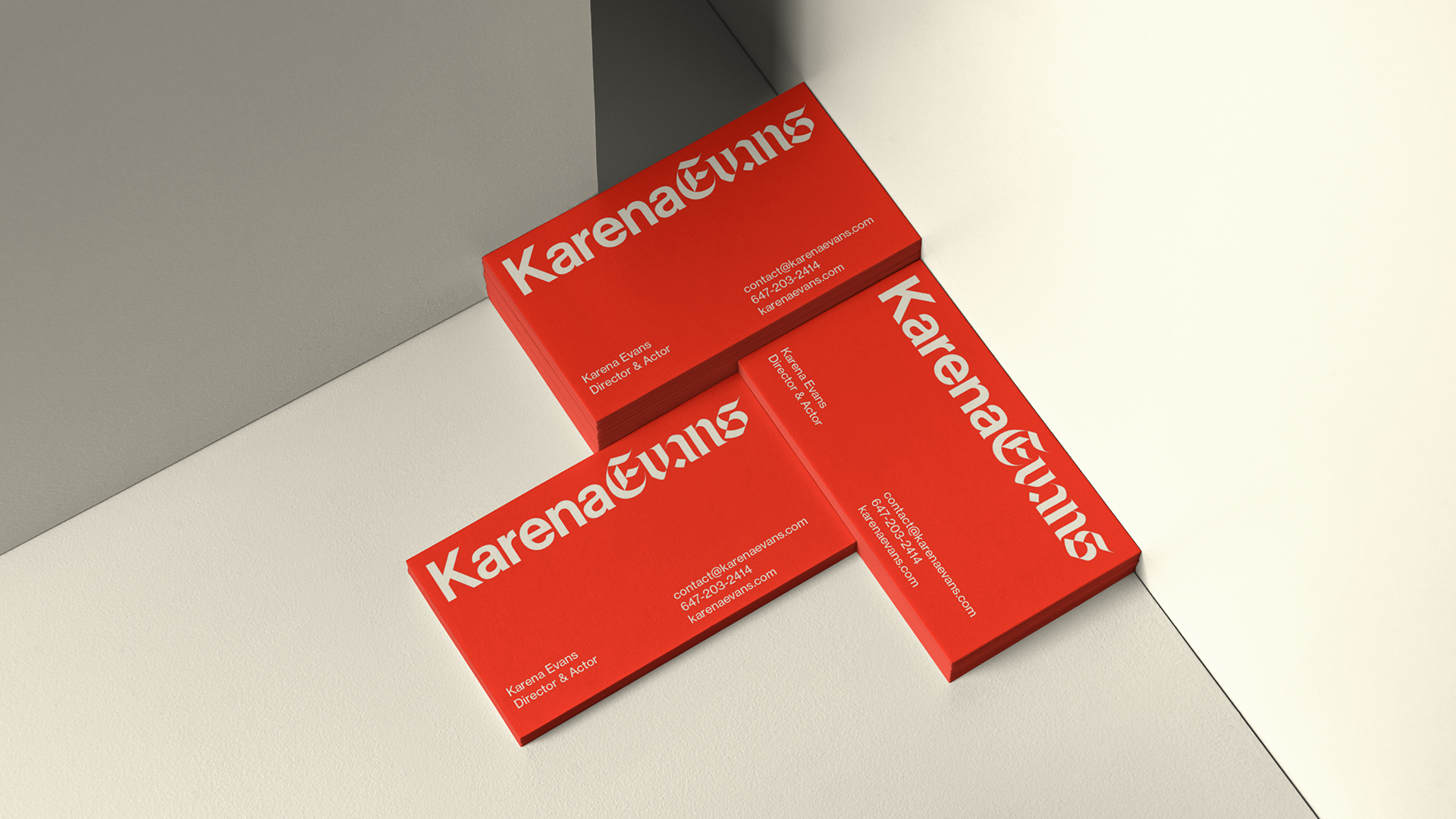
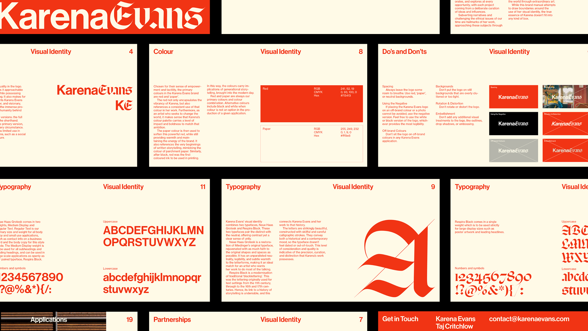
From this understanding then came the logo, which precisely combines 2 typefaces to be approachable and humble, allowing her work to take centre stage, while also positioning Karena as a visionary in her industry with unique contributions to a rich history of storytelling.
This included using a typeface that modernises traditional ‘blacklettering’ (the lettering originally used for text settings from the 11th to the 17th century). This then conveys both a historical and a contemporary mood, tying Karena’s work to the history of telling stories, but bringing that artistry into modernity.
The colours were also carefully curated for the Karena Evans brand, chosen mainly for their sense of empowerment and tactility. The red used not only encapsulates the vibrancy of Karena and the energy behind her creations, but also references a consistent use of that colour in her work. The ‘paper’ colour is then used to soften the red, while referencing the very beginnings of written storytelling by mimicking the colour of parchment paper.
Result
This thoughtful combination of colour and typography carves out a distinct identity for Karena, paying homage to her distinguished style and character, while maintaining the humility required for her work to do most of the talking. It is a brand identity that mirrors the care, quality, and timelessness of her art, and one that can grow with her as her career evolves and expands.
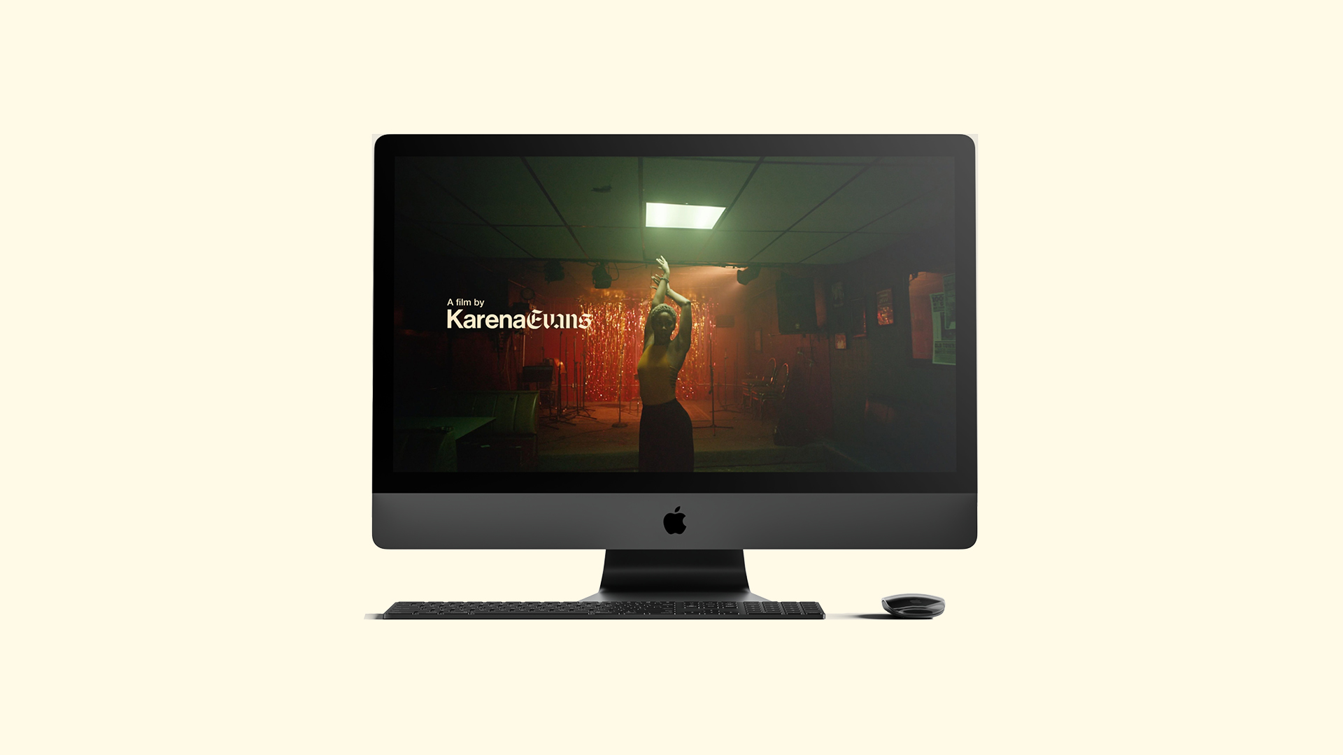
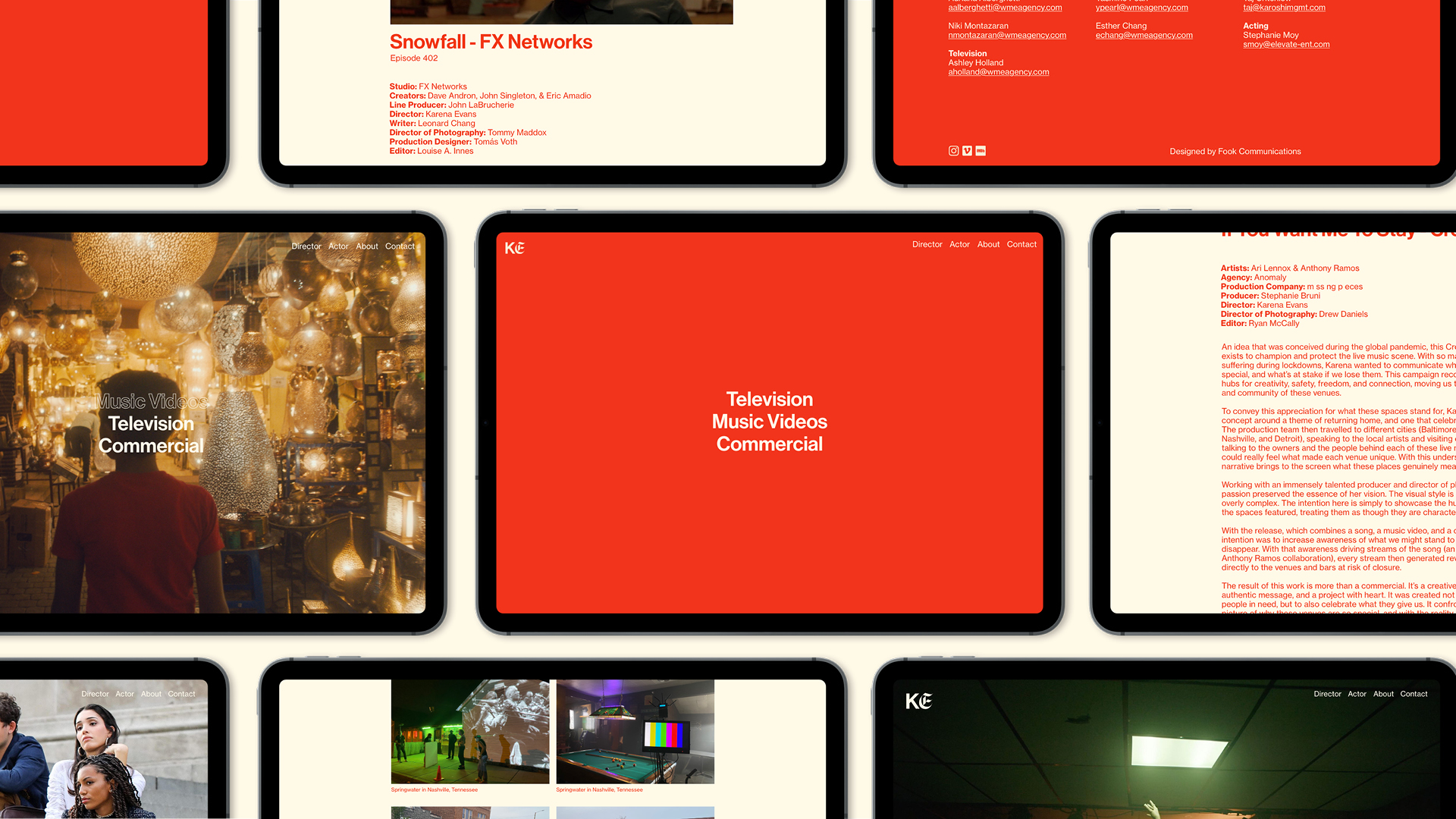
It also laid the perfect foundations for us to design and develop her beautiful new website, which puts bold presentations of her work front and centre while clearly stamping her brand identity onto it.
We then consistently applied this identity onto her pitch decks, invoices, letterheads, and other internal materials to give her a cohesive and meaningful brand, that very few of her peers possess.
